Levata e Rintocco
– visual identity, naming, illustration,
label design, packaging
(2019)
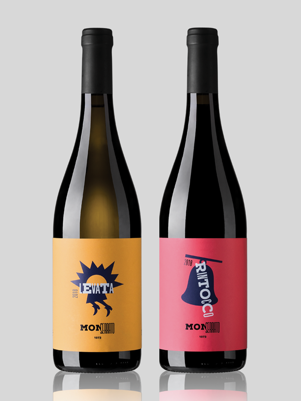
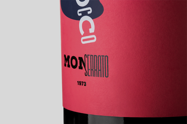
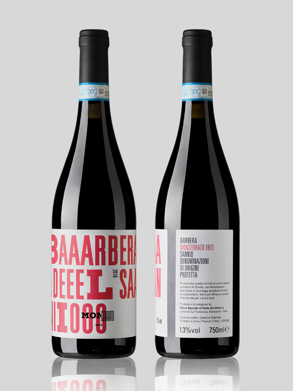
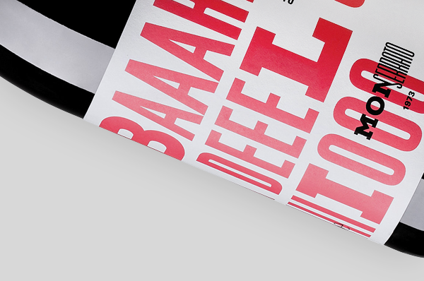
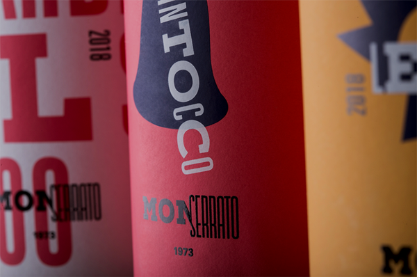
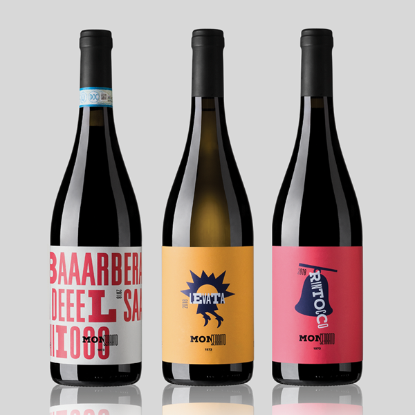
L'identità di prodotto per Monserrato 1973 si completa con il disegno delle linee dei vini, due aziendali di base e tre monovarietali (il primo uscito è il Barbera del Sannio). L'immaginario da cui muove il progetto, legato a certe credenze popolari secondo cui fattucchiere e diavolerie varie abitino la zona del beneventano, si arricchisce di rimedi salvifici e di buoni auspici. Se Benevento è terra di streghe, è anche vero che la leggenda vuole che al sorgere del sole scappino via a gambe levate, e che il rintocco delle campane le tenga lontane. Ma non sapremo mai se quelle vocali, quasi urlate in etichetta, rappresentano più le voci di sconfitta o le note di una momentanea liberazione.
These wine labels complete the visual identity project for Monserrato 1973. There are two basic company bottles and three monovarietal ones ('Barbera del Sannio' is the first release). The names of the products refer with an ironic tone to some folk tales about the city of Benevento, where the company is located, famous as an ancient land of witches and devilries. According to legend, witches escape at sunrise ('Levata') and the sound of bells keeps them away ('Rintocco'). But we will never know if that vowels, almost shouted on the third label, represent more the voices of defeat or the sounds of a momentary liberation.
© 2024 Mino Sebastiano - info@minosebastiano.com